How Tenants Use Digital Mapping to Track Bad Landlords and Gentrification

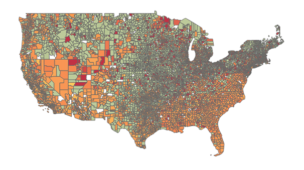
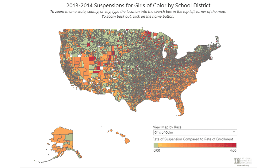
This map produced by the National Women’s Law Center shows suspension rates for girls of color broken down by school district nationwide for 2013-2014.
When Teresa Salazar first encountered the notice posted to her front door—which offered tenants $10,000 to move out of their East Oakland, California, apartment building—she knew the place she called home was in jeopardy.
“All of us were surprised and afraid because it is not easy to move to some other place when the rents are so high,” Salazar said in a video produced by the Anti-Eviction Mapping Project. The project uses mapping as well as data analysis and digital storytelling as organizing tools for low-income tenants to combat eviction and displacement amid the Bay Area’s raging housing crisis.
The jarring move-out offer was left by the Bay Area Property Group, founded by landlord attorney Daniel Bornstein—known for holding landlord workshops on how to evict tenants. The property management firm buys and flips apartment buildings, Salazar said, driving gentrification in neighborhoods like hers. In fear of being displaced, Salazar and other tenants from her building met with counselors from Causa Justa :: Just Cause, a community legal services group. There, they learned about their rights under Oakland’s Just Cause of Eviction Ordinance. With this information, they successfully stood their ground and remained in their homes.
But not all Bay Area tenants are as fortunate as Salazar. Between 2005 and 2015, Oakland witnessed more than 32,402 unlawful detainers, or eviction proceedings, according to data obtained by AEMP through record requests. But AEMP hopes to change these statistics by arming tenants and housing advocates with map-based data to fight evictions and displacements and, ultimately, drive local and state policies on the issue. In addition to mapping, AEMP uses videos of tenants like Salazar to raise awareness of the human experience behind jaw-dropping statistics.
Median rent in Alameda County increased by 29 percent since 2000, according to a California Housing Partnership report. The Anti-Eviction Mapping Project data visualization above shows this shift in median rent between 2009 and 2015.
The project is part of a rising tide of social justice cartography, where maps are being harnessed for activism as the technology becomes more accessible.
One of the ways that AEMP uses maps and map-based data analysis is to identify where—and under which landlords—evictions are happening the most. Across AEMP’s reports, most recently focusing on Alameda County in California, their wide-ranging maps pinpoint where evictions are happening, frequently targeted neighborhoods, and which property owners possess buildings with the highest rates of evictions. Their “Mega-Evictors” list, generated from map-based data analysis, calls out individual landlords and companies that tenants should avoid, according to the number of eviction notices filed.
The project has also investigated where both Section 8 housing and communities of color are receding rapidly—sometimes even on a block-by-block basis.
Once neighborhoods start experiencing investment, landlords stop accepting Section 8 vouchers that are not competitive with rents from non-voucher holders, writes the Anti-Eviction Mapping Project. Data was collected and analyzed by Matt Palm and Deb Neimeier, National Center for Sustainable Transportation at UC Davis.
In Oakland, much of the community’s African American population has been pushed out, according to AEMP co-founder Erin McElroy. AEMP data found that the city’s black population has decreased 4 percent between 2010 and 2014. “That’s due to both foreclosures and evictions,” she said.
“If we can better understand, then we can do more outreach,” added McElroy. “We are organizing with tenants so they can fight back with more resources.”
Digital mapping tools—like those used by AEMP—are becoming easier to access. Leading GIS company Esri regularly licenses its software for free or discounted to universities and nonprofits, said Britta Ricker, who teaches geospatial technologies at University of Washington, Tacoma. Government organizations, such as Los Angeles’, are increasingly paying the company to offer mapping of city data as a service for the public—allowing the public to illustrate and explore everything from crime trends to the closest neighborhood trash bin.
Oakland lost four percent of its black population between 2010 and 2014, according to data obtained by the AEMP. While the median income for Oakland’s white households was $75,065 in 2014, black households earned a median of less than half that—$35,987.
Esri has also seen massive growth in its Story Maps platform since it began six years ago. Story Maps allows users to supplement interactive, digital maps with photos and descriptions. It now houses well over 350,000 projects posted on Esri’s cloud service, according to Allen Carroll, who heads Esri’s StoryMaps.
“Consumers are more sophisticated and comfortable with maps thanks to apps like Google Maps,” said Carroll, who sees tremendous potential for mapping to grow outside the typical GIS user base, which largely sits in the science and conservation sectors. Already, social- and demographic-based mapping are on the rise, he said.
Maps are also being paired with storytelling and narrative tools to amplify data-driven advocacy. Many nonprofits have found that this kind of storytelling is a successful driver of activism and fundraising, said Hannah Wilber, a multimedia journalist at Story Maps who previously worked at African Wildlife Foundation. Wilber points to organizations like the World Wildlife Fund, which regularly interweaves place-based narratives into its conservation outreach efforts.
And while Esri is the industry standard, Ricker said, other mapping software is gaining traction across the nonprofit sector, such as QGIS, a free, open source alternative, and CARTO, which allows users to map smaller data sets without cost. With this influx of easy-to-use technology, Ricker cautioned mapmakers to question every output, especially as users become more reliant on automation for data processing.
“I think it’s great that more GIS is becoming accessible, but we need to use it responsibly,” she said. “When you click to generate a hotspot map, what is the math? What is happening?”
McElroy sees developers, realtors, and tech companies using maps to present skewed renderings of the neighborhoods she’s trying to protect. For example, the data center company Digital Realty placed maps on Bay Area Rapid Transit trains that called West Oakland “the new edge of the Silicon Valley” in hopes of drawing new clientele to the area.
“Maps are definitely never neutral,” said McElroy. “For us, it’s important to show these countermaps that give other stories.”
Social justice organizations are also using map-based data analysis to prod lawmakers and inspire engagement.
AEMP regularly provides their geospatial data as evidence in court and to change local and state laws. McElroy said data from maps created by AEMP have been used as public records in city council meetings and to investigate the financial backing of evictors in an effort to hold banks accountable for the mortgages and loans that lead to displacement.
AEMP has also worked alongside community groups in Oakland to pass Measure JJ—which expands just-cause eviction regulations and requires landlords to request approval for non-standard rent increases—to make the Oakland Rent Board more transparent and their data publicly available, McElroy said. Prior to the Alameda County released report, no eviction data had been made public in Alameda County or Oakland. Meanwhile, on the state level, AEMP is working with a coalition to repeal the Costa-Hawkins Act, a 1995 law that bars rent control on single-family apartments and homes constructed following that year.
Other organizations are using maps to influence policy, too. The National Women’s Law Center, for example, put out a map earlier this year that displayed suspension rates for girls of color by school district. The data visualization is part of NWLC’s Let Her Learn campaign, which seeks to keep girls in the classroom. Suspensions lead to students’ disengagement from school, lower self-esteem, and sometimes even dropping out altogether, said NWLC education policy fellow Kayla Patrick.
The map, along with an accompanying evaluation toolkit, provides parents and students the opportunity to examine their own school districts, see what policies and discipline codes exist, and determine whether they are discriminatory by race or sex. Above all, Patrick said, the map provides a tangible illustration of how statistics actually translate: for example, how black girls nationally are five-and-a-half times more likely than white girls to be suspended than white girls, according to NWLC.
“If you look at the school district map, you can see it’s happening in your backyard, in your community,” she added. “That’s the powerful thing about this map. It gives the opportunity to engage and relate to what’s happening.”

This map produced by the National Women’s Law Center shows suspension rates for girls of color broken down by school district nationwide for 2013-2014.
Last June, Patrick spoke with educators at the National Education Association’s Conference on Racial and Social Justice, discussing the map and fleshing out the toolkit for teachers to use with their students.
Already, many educators utilize geospatial visualizations of social and historical issues in their classroom discussions. A decade ago, it was hard to find a student interested in demography or using a map as part of a project, said Marcia Chatelain, associate professor of history and African American studies at Georgetown University. Now regularly when students write papers in her classes—whether about gentrification, the Trans-Atlantic Slave Trade, or the Great Migration—many will incorporate maps, she said.
“I think the ability for people to quickly acquire the skills to provide maps for meaningful analysis has allowed students to translate their written work into visual projects,” Chatelain said.
One historical topic her students are working on is education desegregation and the opening and closing of schools. Looking at the demographic geospatial spread of populations in cities like Chicago or Washington, D.C., sheds light on which schools were opened and closed—and why.
Last spring, McElroy spoke at a conference called Resistance GIS, which brought together activists and educators using mapmaking to further their social justice goals. Fellow speakers included Ricker and Verónica Nelly Vélez, who’s written on maps as a teaching tool for social change.
“It’s been this new kind of revolution,” McElroy said.


